The metro map metaphor for treewidth
Harry Beck’s 1931 map of the London Underground transit system has been justly heralded. It abstracted the messiness of above-ground geography into simple lines in restricted directions and made a complex system visually understandable. Since Beck’s breakthrough, metro maps around the world have followed similar styles.
The same style can work for many other kinds of visualization as well. Already in 2001 researchers were introducing “metro maps as metaphors” for links between web pages, again thought of as a system that one navigates from stop to stop.1 By 2004 the idea had expanded to the summarization of complex documents such as theses, business plans, and course syllabi.2 More abstract structures to which this idea has been applied include set systems and hypergraphs.3 Google Scholar currently gives my some 618 results for a search with the terms “metro map” and “metaphor”.
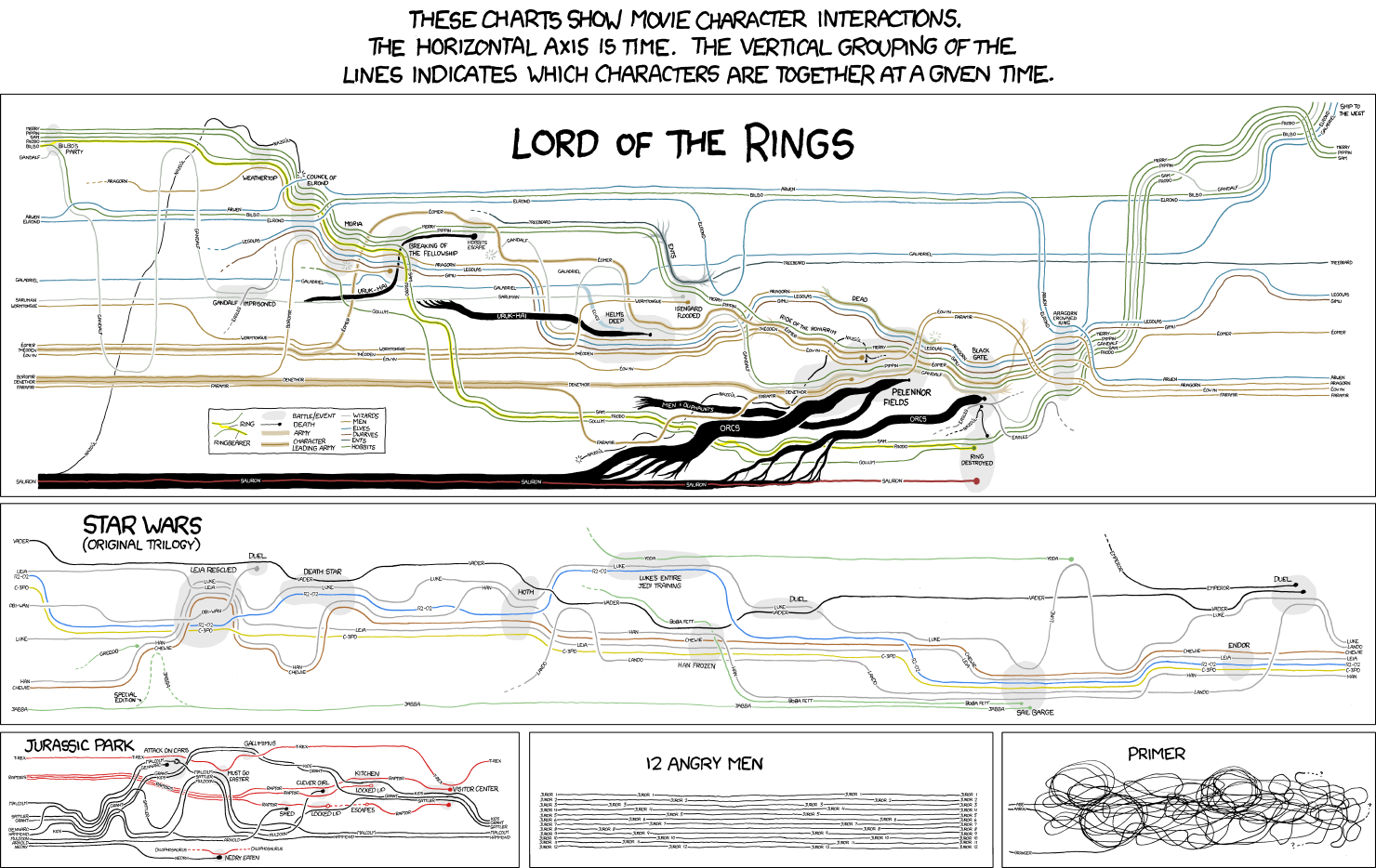
In many of these early maps, the lines of the abstract metro system all run along distinct paths, but in Beck’s 1931 map some lines ran parallel for short distances or, in the case of the District and Picadilly lines, for much of their lengths. The idea of using this sort of parallelism in abstract metro map visualizations was given a big boost by the 2009 xkcd “Movie Narrative Charts” visualization of character interaction timelines in The Lord of the Rings, Star Wars, and some other films.
Real-world metro maps have crossings where the metro lines cross, of course; that can’t really be controlled. But where lines run in parallel bundles, and then diverge, you can also have crossings at the points of divergence that may or may not be necessary. This depends on how the lines are ordered within each parallel bundle, and graph drawing researchers have studied how to optimize this ordering to minimize crossings.4
One of the latest entrants in this long line of abstract metro map research is my new preprint “Visualizing treewidth”, with Alvin Chiu, Thomas Depian, Michael T. Goodrich, and Martin Nöllenburg, to appear at Graph Drawing. As the title suggests, the abstract structure we’re visualizing is a tree decomposition. This can be thought of in terms of a metro map for a metro system whose overall structure looks like a tree, without loops (unlike even 1931-era London). The vertices of the graph form the lines of the metro map, connecting from station to station in parallel bundles along the edges of this tree, with some lines having internal branches rather than just being a path (as the 1931 District and Picadilly lines did). The stations of the map are called “bags” in tree decomposition terminology; these are where certain pairs of these vertices interact to form edges, but two vertices can also pass through a station without interacting with each other. Therefore, we need to go beyond the metro map metaphor and draw some additional structure within each station, showing which pairs of lines have edges and which do not.
Here’s a simple example, from Figure 2 of the preprint, showing a conventional node-link diagram of a graph above a metro-map style diagram of one of its tree decompositions. Each of the seven stations of the metro map (the bags of the decomposition) has a graph drawn within it, the induced subgraph of the vertices whose lines pass through that station. Some lines visit only one station and are drawn only as a vertex within that station. The width of a decomposition is the maximum number of lines per station (minus one, for historical reasons); here the width is three because all seven stations have four lines running through them. This is an optimal tree decomposition: the four central vertices of the graph form a clique and must be present together in at least one station. Therefore the treewidth of this graph is also three.

For several variations on this drawing style and many more examples, including tree decompositions of several famous graphs, see the new paper.
-
Sandvad, Grønbæk, Sloth, and Knudsen (2001), “A metro map metaphor for guided tours on the web”, WWW; Bang (2001), “Knowledge sharing in a learning resource centre by way of a metro map metaphor”, Libraries and Librarians: Making a Difference in the Knowledge Age, both reporting on a system in use at the University of Aarhus. ↩
-
Nesbitt (2004), “Getting to more abstract places using the metro map metaphor”, Int. Conf. Inf. Vis. ↩
-
Jacobsen, Wallinger, Kobourov, and Nöllenburg (2020), “MetroSets: Visualizing sets as metro maps”, TVCG; Frank et al. (2021), “Using the Metro-Map Metaphor for Drawing Hypergraphs”, SOFSEM. ↩
-
Bekos, Kaufmann, Potika, and Symvonis (2007), “Line crossing minimization on metro maps”, Graph Drawing; Nöllenburg (2009), “An improved algorithm for the metro-line crossing minimization problem”, Graph Drawing; Argyriou, Bekos, Kaufmann, and Symvonis (2010), “On metro-line crossing minimization”, JGAA; Fink and Pupyrev (2013) “Metro-line crossing minimization: Hardness, approximations, and tractable cases”, Graph Drawing. ↩