Half a dimension short
Google Earth (or the 3d view in Google Maps) has a topology problem.
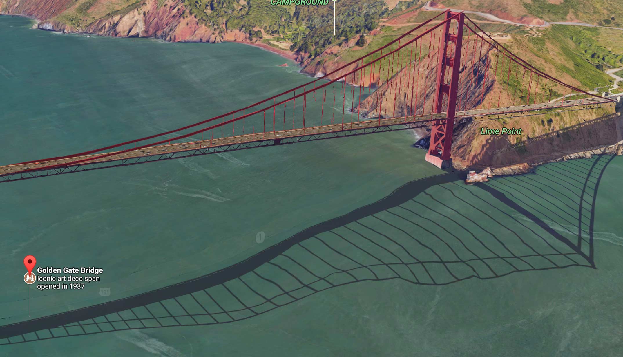
It’s been noticed plenty of times before, by the Huffington Post in 2011, the Weather Channel in 2014, and the Guardian in 2016, among others. But now it’s been fixed, you say? Just look at the Golden Gate Bridge! Isn’t it so much better now than in the 2013 image from the Guardian story?
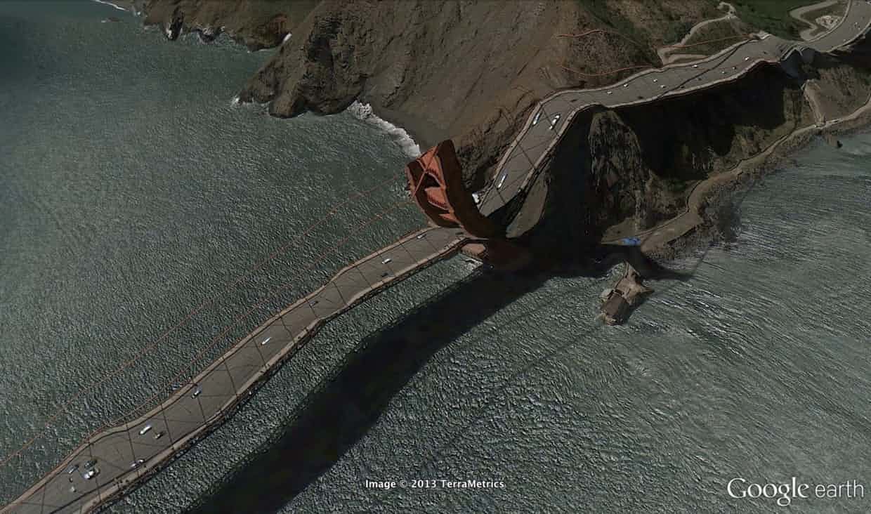
Yes, it’s better, enough that at first glance you’re unlikely to see any problem. And it’s not just a flat billboard or a three-dimensional solid block with a bridge painted on it: You can rotate around it in 3d, and see the appropriate background scenery through the gaps between the towers and cables. But it’s still just decoration, probably a few planes with images on them that have a transparency layer. It’s not actually part of the map. In some sense it’s like the story of the Potemkin village: a false façade that disguises the underlying poverty of the real village.
How can you tell? Well, the flag saying where Google thinks the bridge should be labeled kind of gives it away.But more than that, look at the shadows. The water under the bridge is (at that scale) more or less flat, and more or less opaque. The shadow of the bridge on the water should be as straight as the bridge itself, but it’s not. And there’s a faint outline of the road itself, distorted like the shadow and right above it in the image, far from the decoration that looks like the bridge. That tells us that, underneath it all, Google maps still has a model of the earth as a two-and-a-half-dimensional thing: the two-dimensional surface of latitude-longitude pairs, plus an elevation value (or, under the bridge, depth value) for each point on that surface.
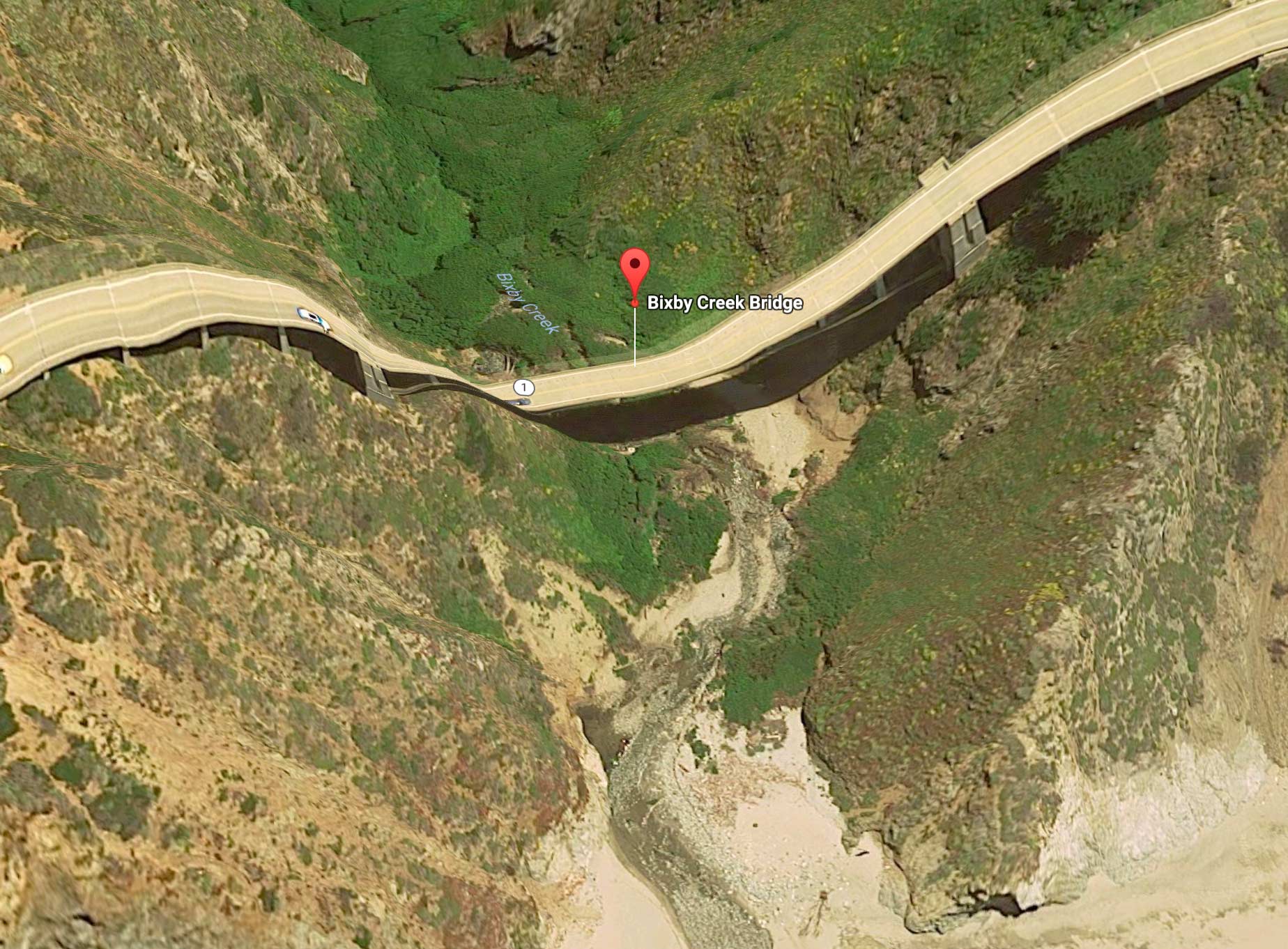
For even slightly-less-famous bridges, it’s even worse, because the decoration part isn’t there. Here’s the Bixby Creek Bridge in Big Sur, in a photograph and in Google Maps.

Replacing this with another decorative bridge-image like the one for the Golden Gate, and painting over the duplicate flattened bridge with greenery, would help. But unless Google Maps makes an expensive change to its underlying data model, it will still just be a patch that hides the problem. The actual problem is one of topology: the Earth’s surface is not topologically spherical. It has handles that stick out of it and holes you can pass through; some are man-made, like these bridges, others natural. Some parts of the earth really have two different layers, with different things that should be shown for them. (Some have a lot more than two: within Google Street View, Tokyo Station has eight levels.) And those can’t be represented by elevation data over a flat or spherical surface.