New Google+ user interface
Come on, Google, you can do better than this. Put the "you might like" entries under the stream, instead of under the trending topics. That way, you can reduce the useful part of the UI to an even tinier fraction of the screen, and make the web browsing experience match the smartphone experience even more closely.
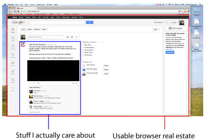
ETA: For a lot more on this, see #whitespace on Google+. In other news, Google+ is now trying to be twitter as well as trying to be facebook.