New uses for old illustrations
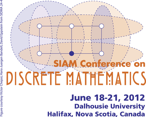
Probably I knew this already long since and forgot, but I recently rediscovered the fact that the 2012 SIAM Conference on Discrete Mathematics is using one of my illustrations as its logo.

It's from a paper with Bandelt and Chepoi on squaregraphs, and what it illustrates is the process of augmenting a family of sets (the ovals and white circles) by adding additional elements (the dark circle) so that the augmented family has the Helly property: any pairwise-intersecting subfamily has a common element. I illustrated the same thing (with the same sets) more whimsically, in the Wikipedia article for median graphs:
The two illustrations weren't originally lined up quite so similarly to each other but the SIAM designer rotated the logo from its original vertical orientation, coincidentally giving the sets and elements the same placement as they have in the mouse version. As for why the ovals are so asymmetric: it's to make room for some labels giving the sets and the added element names, in order to explain some of the notation in the paper.