Potential method of amortization and bad graph drawing
I'm teaching graduate data structures this quarter, and my first lecture was today. I started with the example of turning a slow selection sort algorithm into a fast heap sort, while keeping the pseudocode the same: repeatedly find and remove the minimum element from the input set and add it to an output sequence, but use a data structure for the "find and remove the minimum" part. From there I segued into the problem of maintaining a dynamic array (for instance, to hold the output of the sort algorithm) which I used as an example of amortized analysis using the potential method. When I looked at them later, most of the Wikipedia articles on these topics seemed at least somewhat informative, but the potential method one required a complete rewrite — in its previous state, I didn't think it was readable even by someone who already understood the subject. I'm not convinced that I've explained it anywhere close to as clearly as possible, but at least I think it's better now.
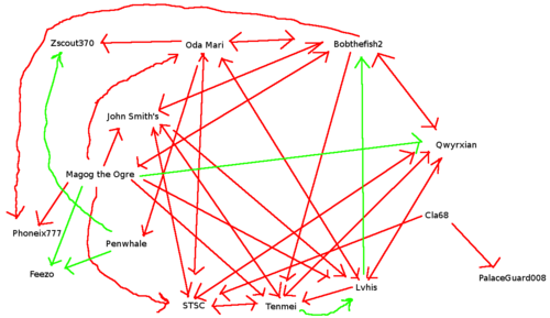
Also and unrelatedly: normally, when I post graph drawings here, it's because I think they're particularly nice in some way: pretty, informative, or preferably both. Below, by contrast, is a really ugly graph drawing. It has to do with a geographic naming dispute, the Wikipedia editors who have weighed in on it, and whether they praised (green) or criticized (red) other editors' opinions.
Comments:
2011-09-27T16:57:25Z
Perhaps a case where an ugly graph is actually appropriate.
