A tale of two graph drawings
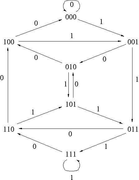
The two very different graph drawings, below, are of the same graph, the three-dimensional binary De Bruijn graph. Which is a better drawing?
My own opinion: ignoring the pixelization, as a drawing of an individual graph, the second one is much better. The first one has many crossings and the spiraling pattern makes it very difficult to follow the edges. But as a drawing of a general class of graphs, the first one is better despite all the crossing and spiraling. The pattern of its drawing generalizes to any dimension of De Bruijn graph, showing how the structure varies with the dimension, it makes it easy to see that the De Bruijn graph is a two-queue graph, and it immediately suggests an analogy with the dynamic system \( x \to 2x \pmod{1} \).
(The first drawing, btw, was inspired by a similar image in Fig.11 of my paper Searching for Spaceships.)
Comments:
2006-10-12T19:04:48Z
Wow, that's really lovely!
2006-10-12T20:33:27Z
Thanks! I considered including something about which drawing I find more aesthetically pleasing, but I thought that would distract from my other points.
