A multicolored checkerboard
After giving my last two lectures of the school year today, I'm not up for much more than posting pretty pictures, so:
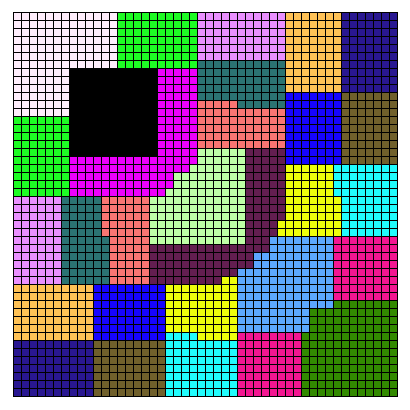
This diagram is a visualization of the partition of matrix data among 18 different processors in a distributed algorithm. The connections between data elements A[x,y] and their transposes A[y,x] is stronger than the connections between adjacent elements, so many subsets of the partition are disconnected, consisting of two pieces symmetrically placed across the main diagonal of the matrix from each other.
The part I'm interested in here is the choice of color for the visualization. We would like colors that are all distinguishable from each other, so that even when subsets are disconnected we can tell which pieces belong to which subset; this figure is a little defective in this regard, with two similar pinks. We would also like to make the partition boundaries visible by choosing especially distinct colors for pairs of sets that share a boundary. Mike Dillencourt, Mike Goodrich, and I have been working on the problem of automatically choosing colors by embedding a graph representing adjacency of partition sets into a three-dimensional space representing the possible colors; it turns out that the choice of three-dimensional color space coordinates is important as some color spaces correspond better than others to human perception. The diagram above was colored automatically by our algorithm, using a color gamut in Lab color space formed by the convex hull of the eight corners of the sRGB gamut.
Comments:
2006-06-09T15:46:42Z
At first glance, I thought this looked like the top view of a baseball stadium.
I suspect that there must be some work in this area, as selection of distinct colors seems to be a common problem.
When I first designed Colordoku (shameless plug), it took quite a bit of trial and error to come up with a set of nine colors that are easy to distinguish from one another. I tried using corners of the color cube, but eventually had to "just pick them by sight" to be satisfied. Even with the colors that I hand picked (which I think are easy to distinguish) I still have people commenting that certain pairs are hard to tell apart.
Have you investigated Edward Tufte? He covers display of information pretty thoroughly. I'll bet that he would have something to say on color selection.
2006-06-09T17:07:02Z
I still have people commenting that certain pairs are hard to tell apart.
Colorblindness and monitor calibration are two big issues related to this...
I suspect that there must be some work in this area, as selection of distinct colors seems to be a common problem.
We did find a number of references on color selection, without the part about making adjacent areas have more strongly contrasting colors:
C. A. Brewer. Color use guidelines for data representation. In Proc. Section on Statistical Graphics, American Statistical Association, pages 55–60, 1999.
C. G. Healey. Choosing effective colours for data visualization. In R. Yagel and G. M. Nielson, editors, IEEE Visualization ’96, pages 263–270, 1996.
H. Levkowitz and G. T. Herman. Color scales for image data. IEEE Computer Graphics and Applications, 12(1):72–80, 1992.
P. Rheingans and B. Tebbs. A tool for dynamic explorations of color mappings. Computer Graphics, 24(2):145–146, 1990.
P. K. Robertson. Visualizing color gamuts: A user interface for the effective use of perceptual color spaces in data displays. IEEE Computer Graphics and Applications, 8(5):50–64, 1988.
C. Ware. Color sequences for univariate maps: Theory, experiments, and principles. IEEE Computer Graphics and Applications, 8(5):41–49, 1988.
We are also already citing Tufte, as he does indeed have something to say on the subject.